
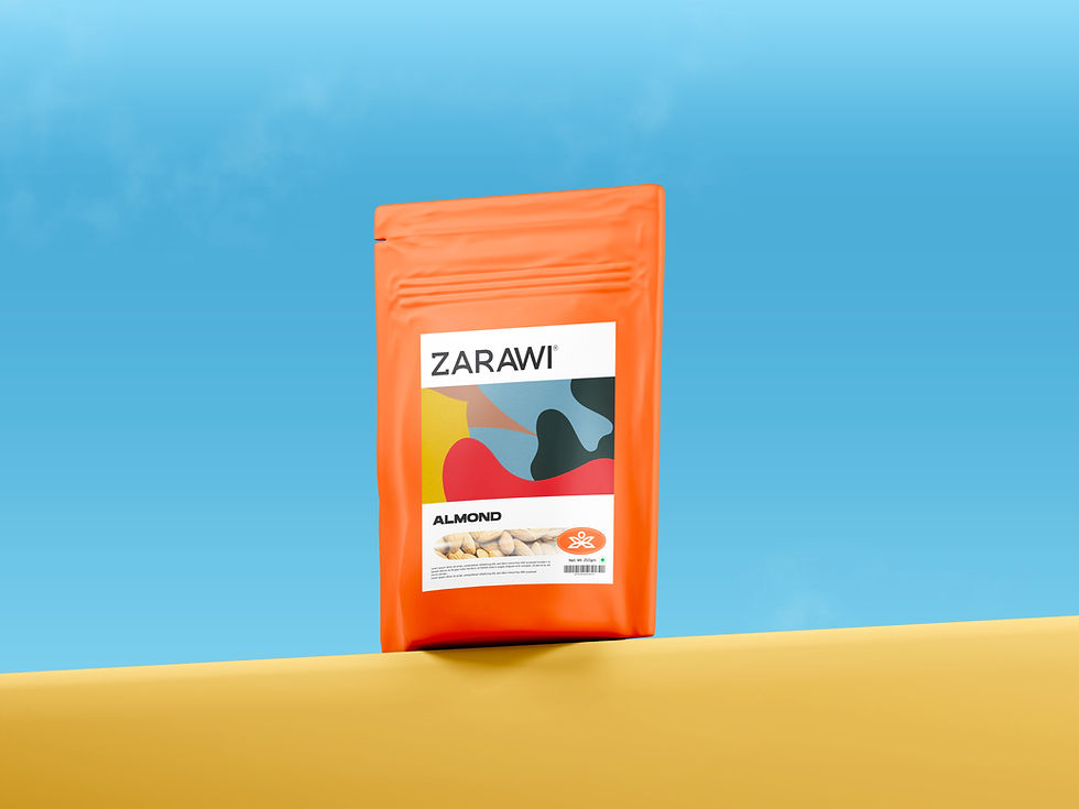
Zarawi
Building a Premium Brand Inspired by Nature
Zarawi is a premium dry fruits and spices brand that required a distinctive identity capable of competing in international markets while staying connected to its natural origins. Our objective was to create a timeless brand that communicates quality, authenticity, and trust through every visual touchpoint.
Our branding journey began with extensive exploration—developing multiple typography directions, logo concepts, symbol variations, color palettes, and real-world applications before refining the strongest ideas into a cohesive identity. The process focused on balancing modern minimalism with organic inspiration to ensure the brand would remain memorable, versatile, and scalable across all platforms.
After evaluating numerous creative directions, the final identity was selected and expanded into a comprehensive brand system. The chosen logo combines a custom wordmark with a nature-inspired emblem, supported by a carefully curated color palette, typography, visual patterns, and detailed usage guidelines to maintain consistency across digital and print applications.
The completed brand guidelines establish a unified visual language for Zarawi, ensuring consistency across packaging, stationery, digital platforms, social media, retail materials, and future marketing campaigns. The result is a premium, recognizable identity that reflects the brand's values while creating a lasting impression in the marketplace.
Deliverables
-
Brand Strategy
-
Logo Design
-
Visual Identity System
-
Brand Color Palette
-
Typography System
-
Brand Pattern Design
-
Brand Guidelines
-
Packaging Identity
-
Marketing & Digital Assets